MINDEF
My Role
I worked with a team of designers to create a CRMS that for employee case management.
Duration:
6 months
Responsibilities:
UI/UX Design, Design Systems, Enterprise Platforms
The Project
An introduction of the client and our deliverablesHigh-level Summary
MINDEF is a Singapore Government Agency that is responsible for
overseeing the national defense in Singapore. They have over 250
employees, and serve all National Service men.
Accenture was hired to help MINDEF design and develop a new
Customer Relationship Management System (CRMS) that would
streamline their existing workflow, and improve the services
provided to their employees and NS men.
Our Deliverables
We had the following responsibilities:
My Role and Contributions
For this project, I took on a more collaborative role to align expectations and deliverables across the different teams. Some of my main responsibilities include:
- Client workshop planning and execution to find out about their pain points and vision for Senior Management Dashboard, synthesising the information and proposing potential solutions to effectively solve the client’s issues
- Managing and working closely with internal teams to understand the limitations of enterprise platform services, and balancing these limitations with the requests of the client
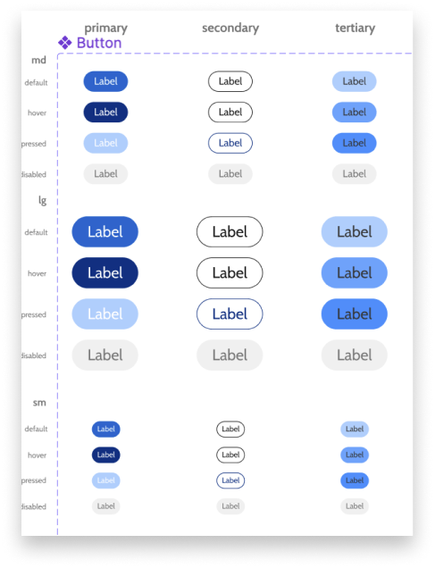
DLS Mapping
Modifying ServiceNow to fit our needsServiceNow x NS Hub
ServiceNow is the enterprise solutioning platform that MINDEF has
chosen to be used to streamline their processes. They offer many
services and solutions out of the box, and
the designers had to figure out what were the best features and
functionalities to be used that would be best suited for the
client's needs.
We also had to ensure that Service Now adhered to MINDEF's
existing Design Language System, NS Hub. As there is no
“one-size-fits-all” Design Language System, the team had to
evaluate the NS Hub DLS to better integrate it into the ServiceNow
Platform.
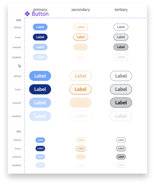
1 to 1 Mapping
To ensure optimisation to ServiceNow, we mapped 162 ServiceNow components with the NS Hub DLS. The design team evaluated components individually and manually re-assigned colours, adjusted typography, layout and spacings to suit the client's brand identity, while maintaing accessibility.
Before Adjustment
After Adjustment
Before Adjustment
After Adjustment
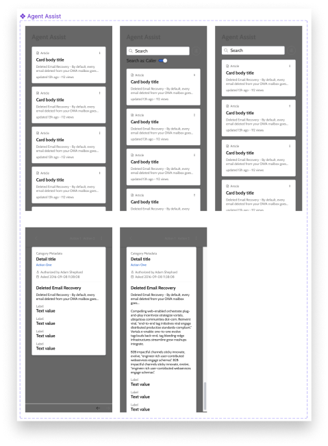
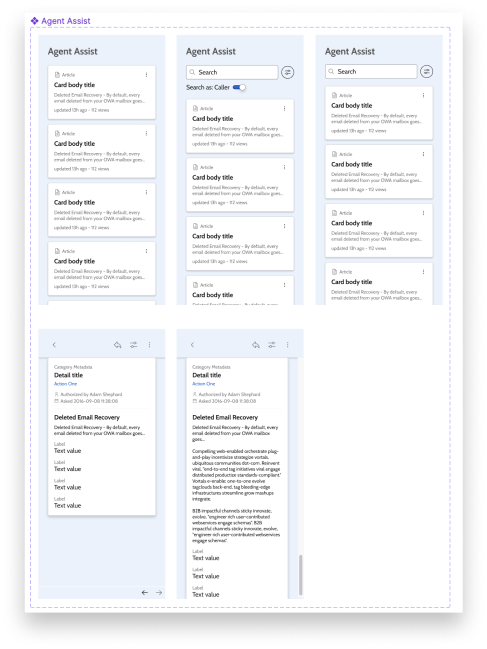
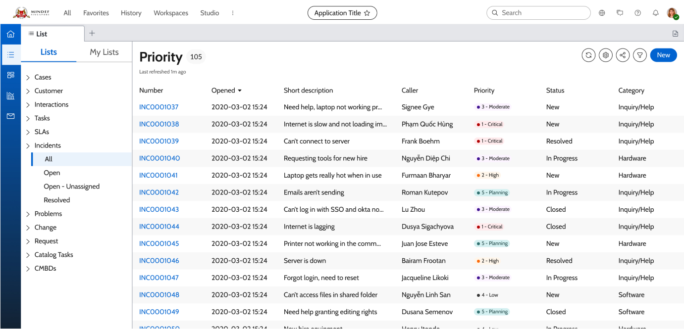
Key Screens
The design team also visualised several key screens to convey potential look and feel of the system. This has helped the client to make informed decisions when proceeding with the design directive given.
Before
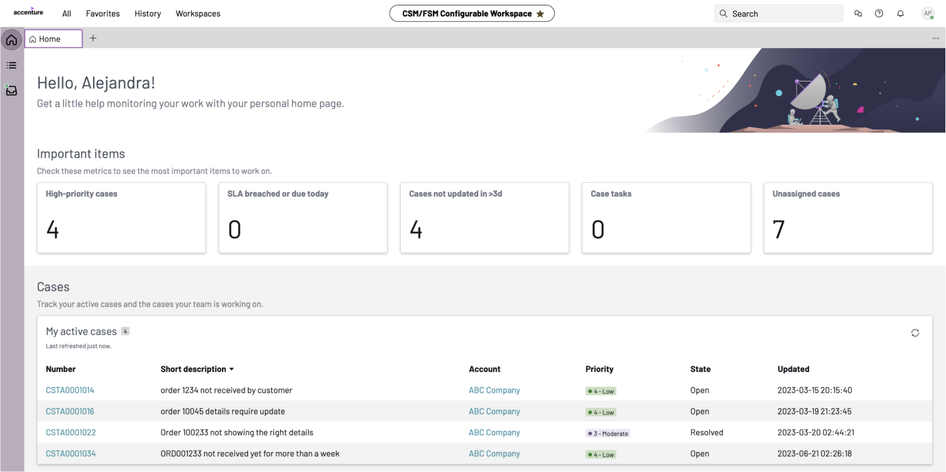
After

Before
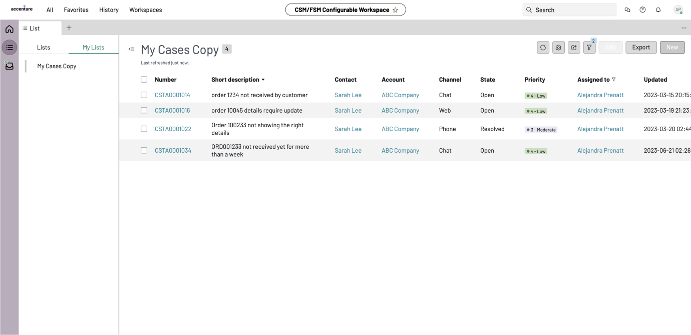
After
Dashboard Workshop
Figuring out the pain pointsPlanning and Execution
In order to find out the client's painpoints of their existing
dashboards and analysis platform, we conducted a workshop to
better understand the various scenarios in which they would use
the dashboard for.
Based on our initial understanding, we created 2 A0 posters of
high-level scenarios, each with a main theme that the user would
want to achieve when doing their case analysis on the dashboard.
These posters were used as a drawing board during the workshop,
where the client's could pen their thoughts onto post its and
stick it onto these posters. This process served to help guide the
client's in figuring out and consolidating what exactly were the
pain points they faced in a systematic manner.


After gathering the pain points from the above activity, we proceeded to prioritise the pain points using our Prioritisation Matrix. This matrix was to help us to figure out what was the most important information and features to have on the dashboard, using 2 measures - the impact this pain point has on decision making, and the frequency which the user will look at this piece of information. This leaves the matrix with 4 quadrants as seen below, and the client would be able to visualise the importance of their pain points against each other as they place the post its into their relevant quadrants.

Synthesis
After conducting a full day workshop with the client, we proceeded
to synthesise all the information by looking at the gathered pain
points, organising, interpreting and categorising them. We
clustered similar pain points, and this helped us to identify
relevant solutions or considerations for each category.
The synthesis process lead us to the following 3 key themes:
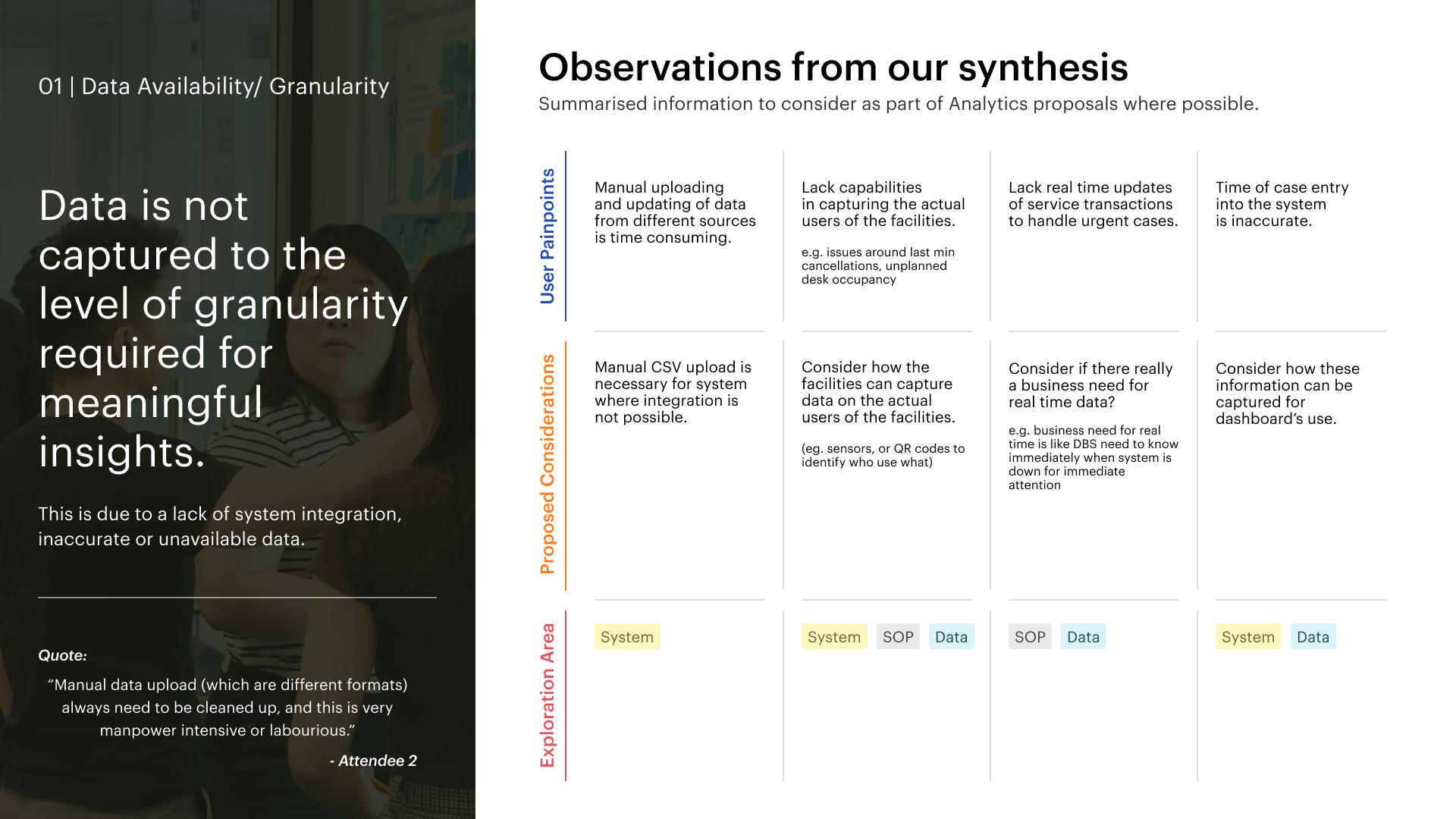
Data Availability / Granularity
Insights related to the lack of external system integration, data inaccuracy and unavailability.
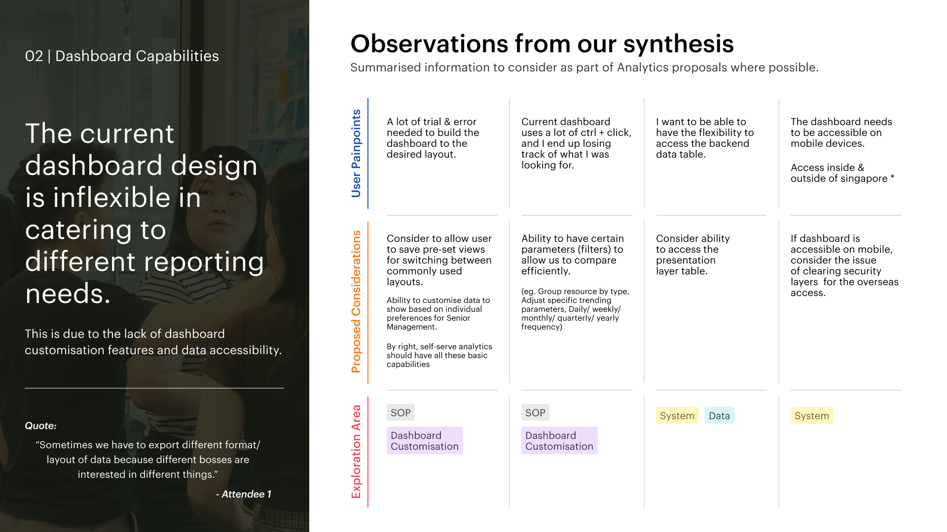
Dashboard Capabilities
Insights related to the functions and features to customise the dashboard catering to the different needs of Senior Management.
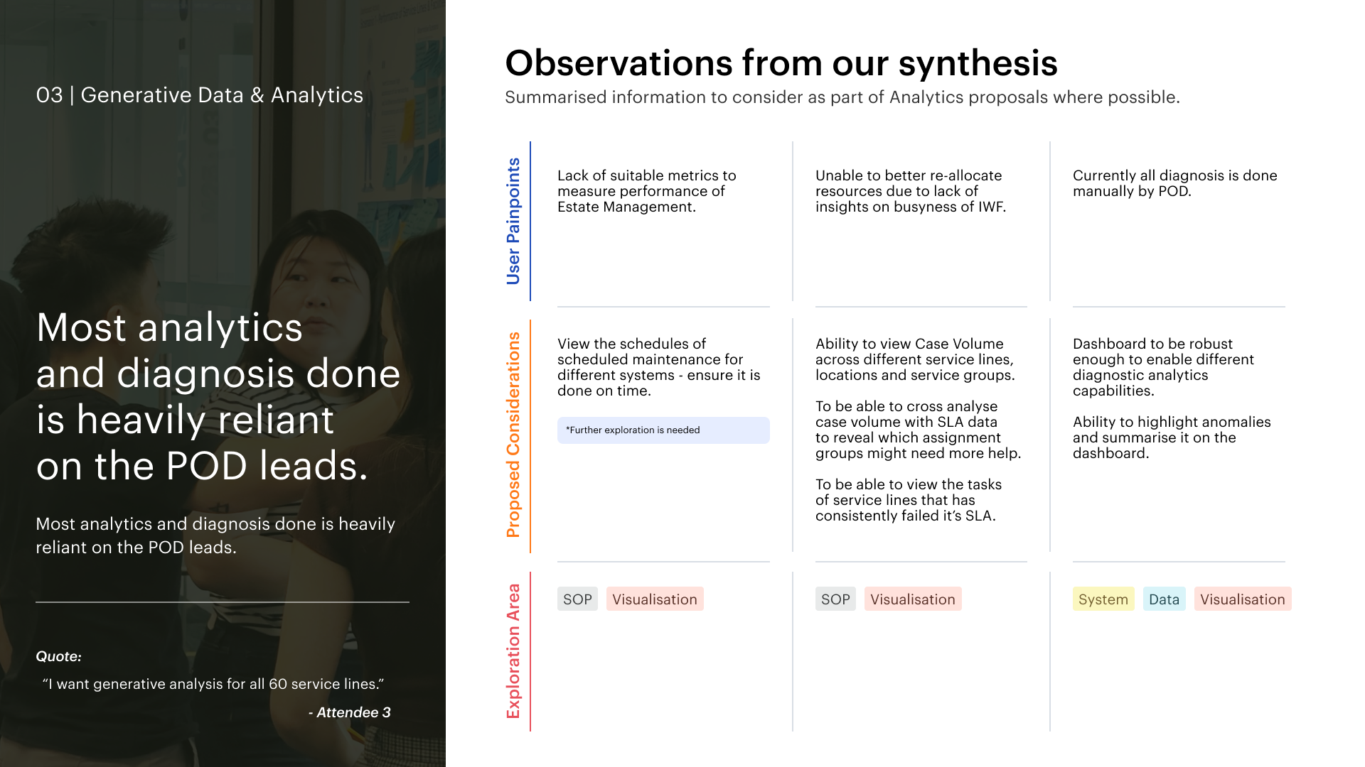
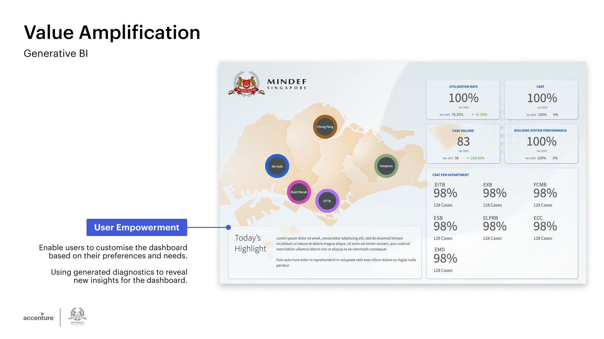
Generative Data and Analytics
Insights related to the data visualisations and potential generative diagnosis that can be further explored.
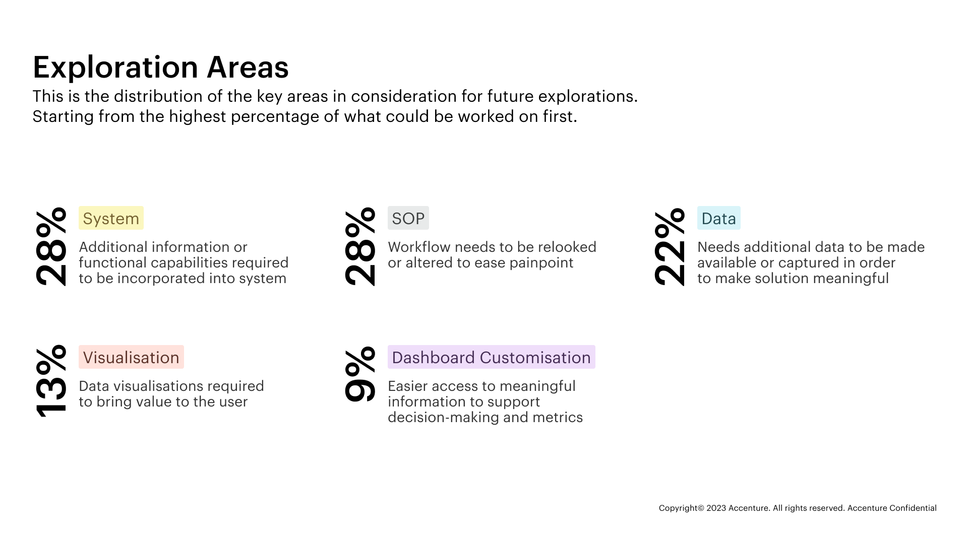
Our Findings
With the 3 key themes, we could further breakdown and summarise the pain points and proposed functionalities to be taken into account when we design the dashboard.
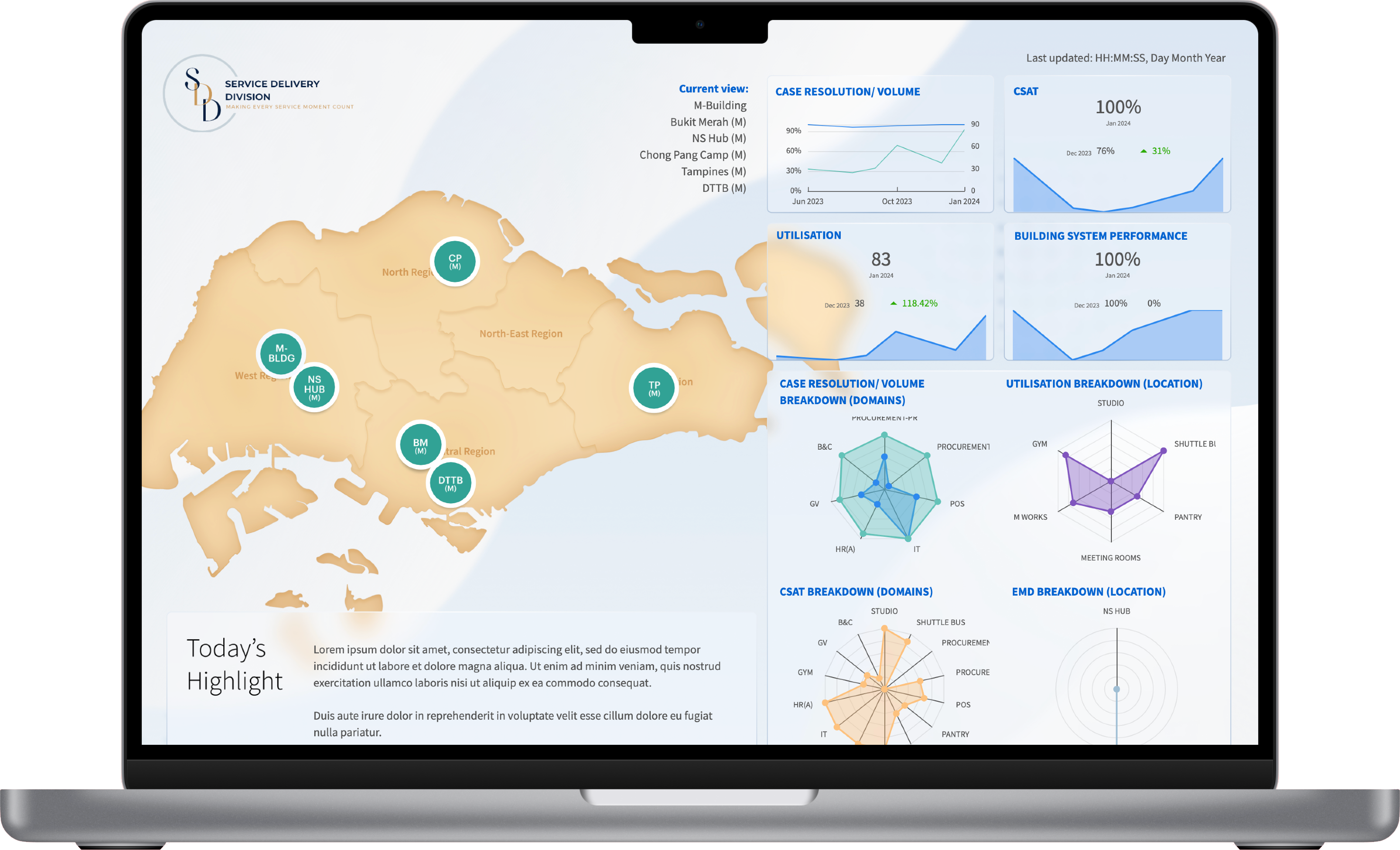
Dashboard
Designing dashboards post workshopThe dashboard was to be built on the enterprise platform Amazon Quicksight. Quicksight is a business intelligence tool that creates data visualisations and dashboards for their users.
Limitations
As with any enterprise product, Quicksight comes with it's pros
and cons. While Quicksight has many technical features such as
machine learning, there was a lot of design limitations to this
platform. When it came to designing the dashboard, it was very
much like PowerPoint, where everything was static and each chart
or component had to be manually adjusted to the right place.
We had to be creative in how we decided to layout each dashboard,
playing around with images, typography and colour to ensure that
the design of the dashboard was aligned to the visual directive of
being consistent with NS Hub, as well as being easily understood
by the client.
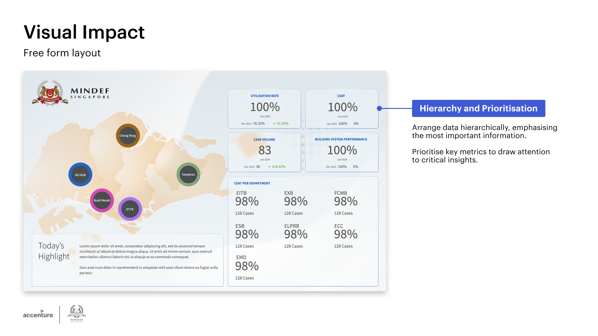
Our Guiding Principles
After we deepened our understanding of the Quicksight platform and
it's limitations, we came up with the following Guiding Principles
to guide our dashboard design process. These Principles take into
account the client's requirements and the design limitations of
Quicksight, and were also communicated to the client and internal
teams to help ensure consistency across all the dashboards.
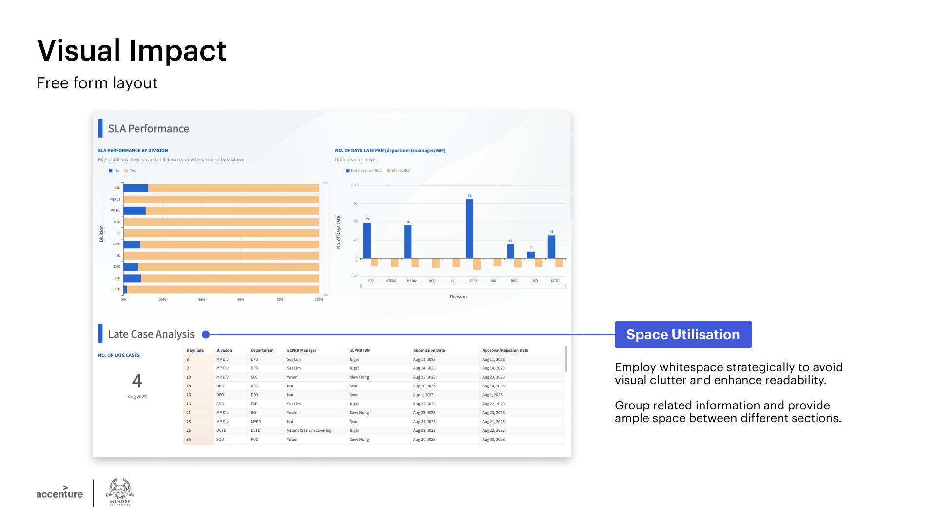
Design Process
When designing the dashboards, we took on an iterative approach to
progressively improve the dashboard design, while keeping in mind
our Guiding Principles. Below are some examples of the our
dashboard designs and how we made use of our Principles to guide
our process.

Guidelines and Templates
After obtaining the client's approval of the dashboard design, we
consolidated the various colours, images, guidelines and templates
that the developers would need to follow to build the dashboard.
Below are some examples of the guidelines done up.

