OCBC HACK-IT!
My Role
This is my individual submission for this hackaton challenge. Below explains in detail my thought process leading up to the high fidelity mock up I created
Duration:
2 weeks
Responsibilities:
Design Thinking & Ideation, UI Design, UX Design, Design Systems, Prototyping, User Testing
Project Brief
A brief overview of what I was tasked to do for design challenge.My Task
Below are the assessment details for the design challenge:
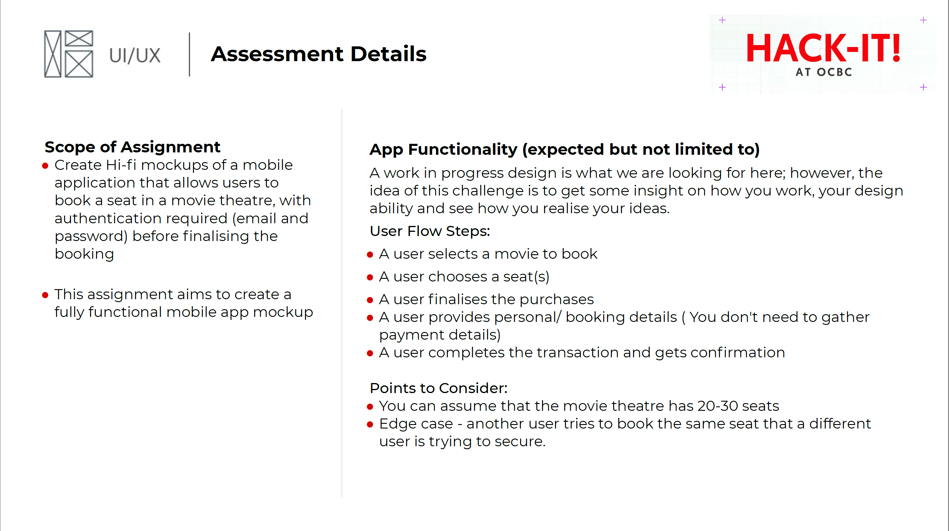
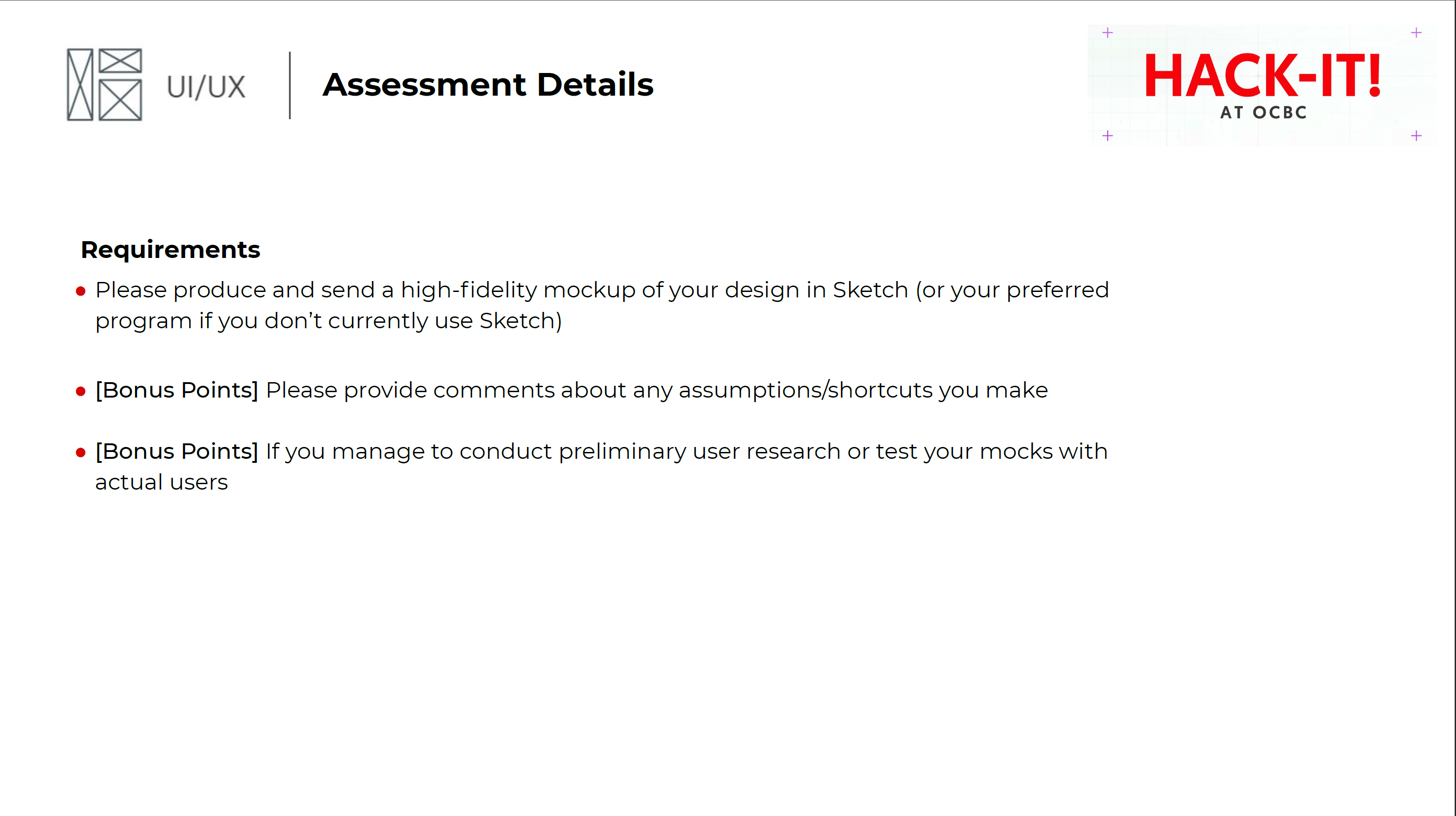
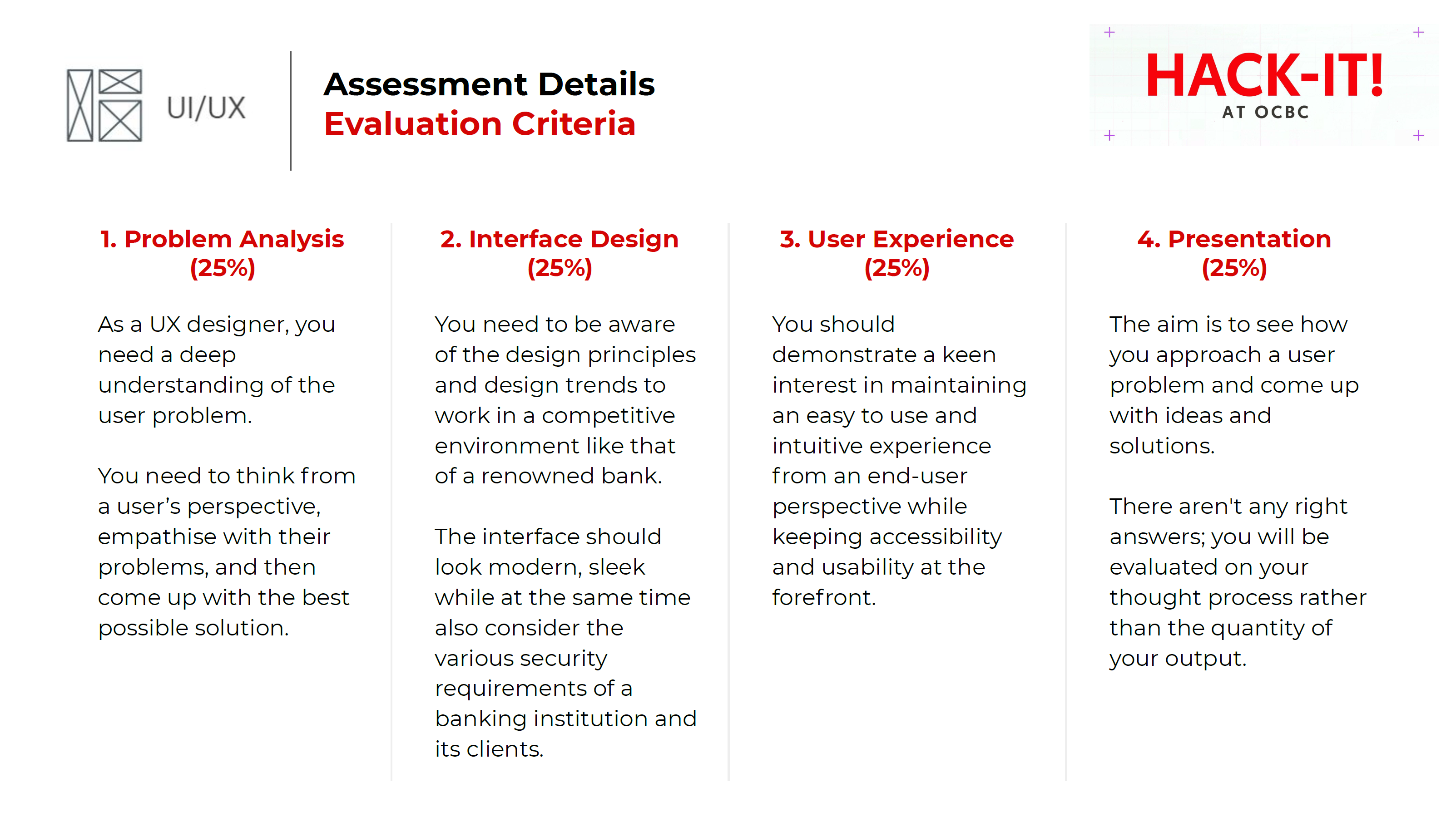
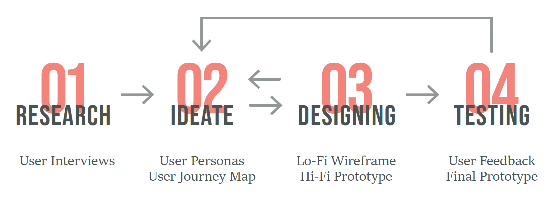
In order to gather insights and better understand potential pain points of users, I followed the below described Design Process.
Research and Interviews
Laying down the ground workUser Interviews
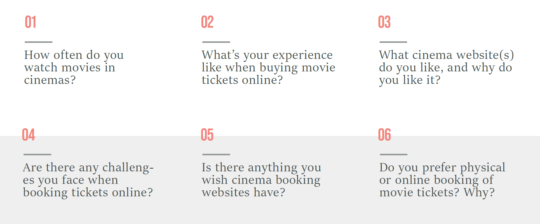
I interviewed some of my friends and family who are students, adults, and both frequent and passive moviegoers. Due to the short timeline, I only managed to talk to 6 participants. Here are the few questions I included:
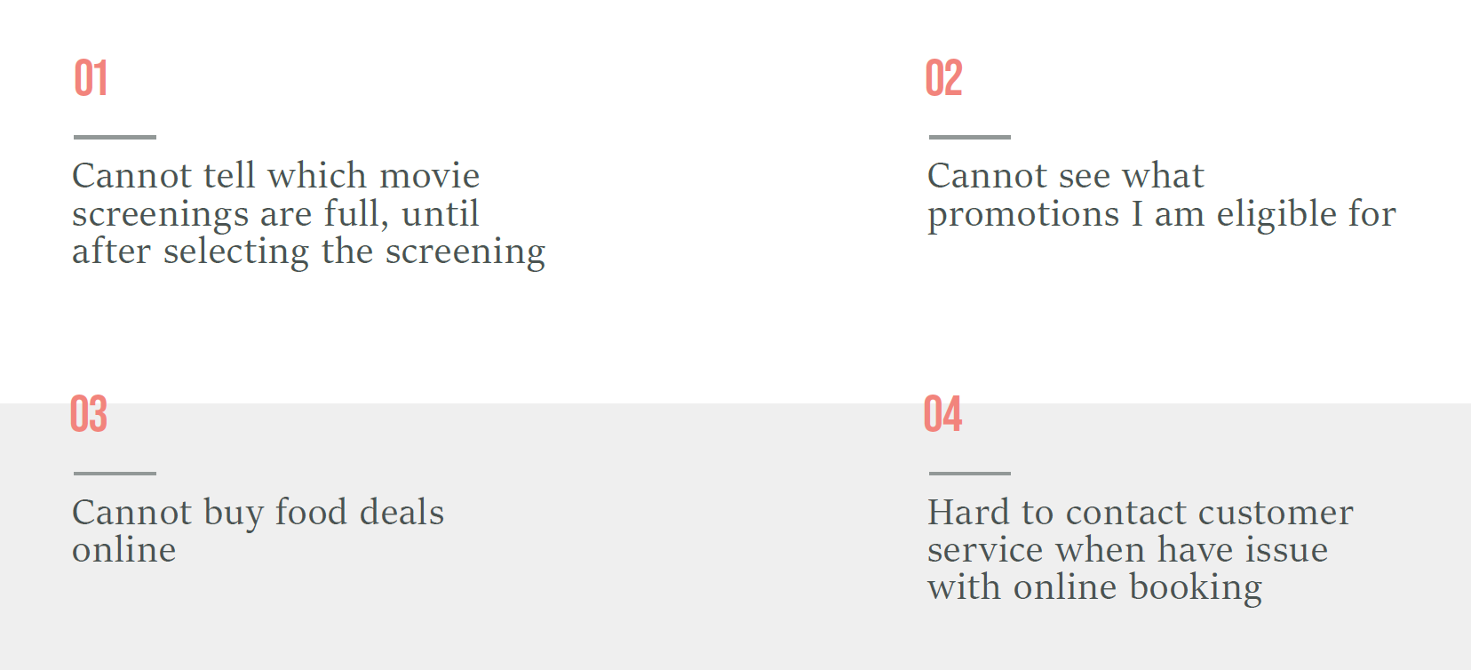
From my interviews, I gathered the below pain points and insights.
Pain Points
Insights

Ideate
Consolidating my findings into a succinct wayUser Personas
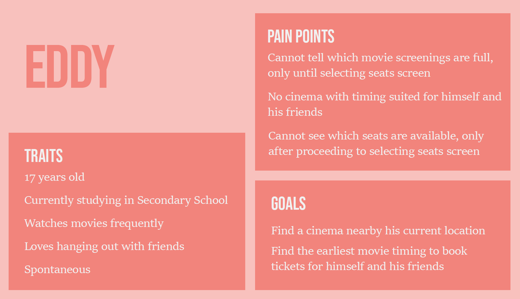
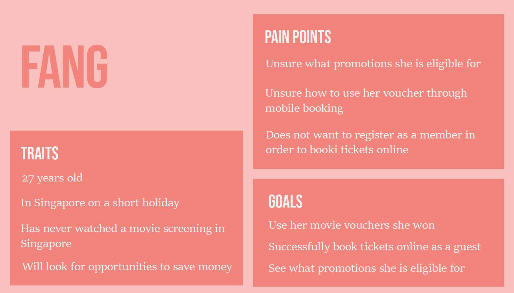
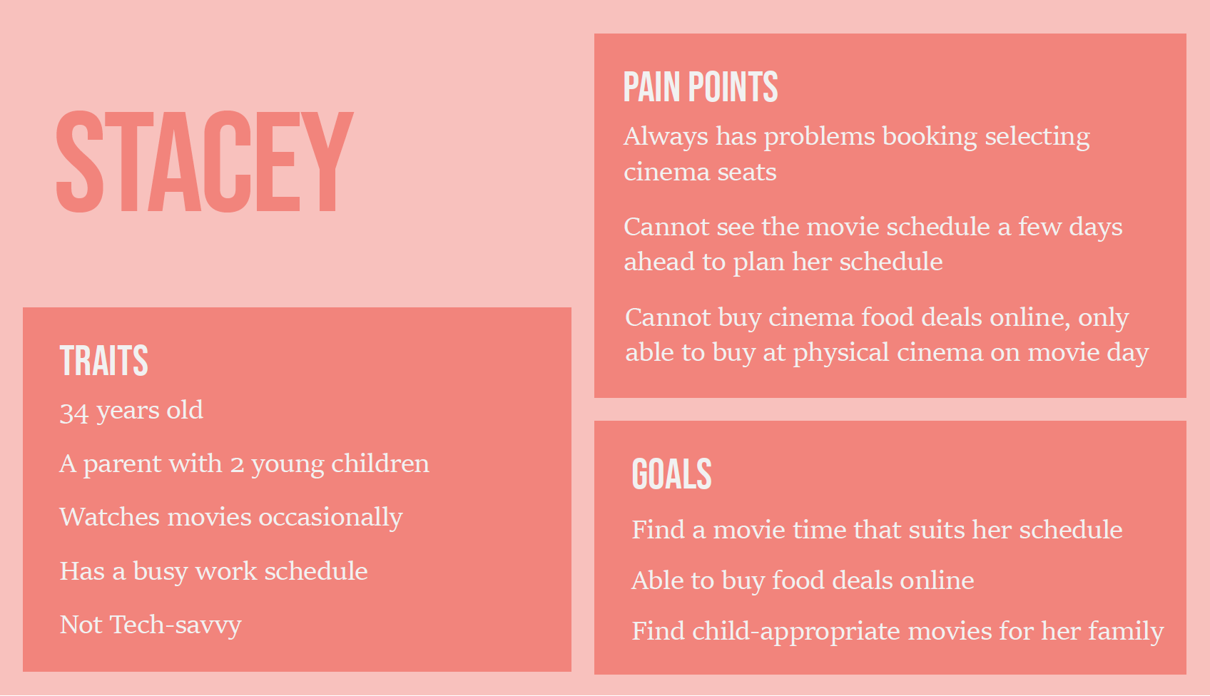
I created 3 different user personas based on the information gathered by my user interviews. They represent some of the target user groups of the website.
User Journey Map
I also created User Journey Maps for each persona to better understand the overall journey which each user may encounter when booking movie tickets online. From there, I could list down the opportunities that arise at each stage.


Designing
Putting everything togetherLow Fidelity Wireframe
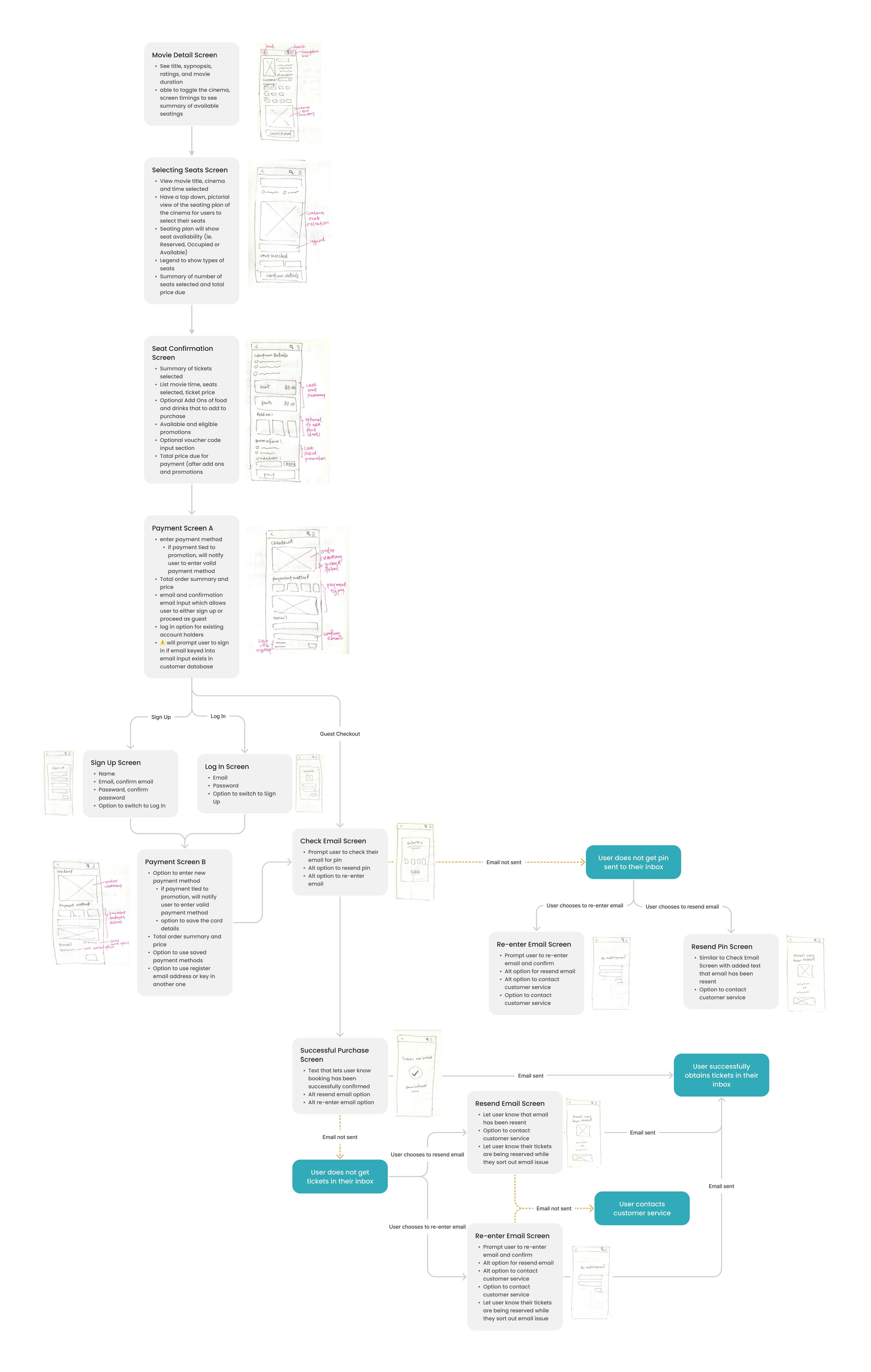
Based on my above ideations, I crafted out the path taken by a prototypical user. The wireframe takes them from their entry point throught a set of steps towards a successful outcome of purchasing movie tickets. For this flow, I also assumed that the user is not initially signed into the app when selecting seats.
Design System
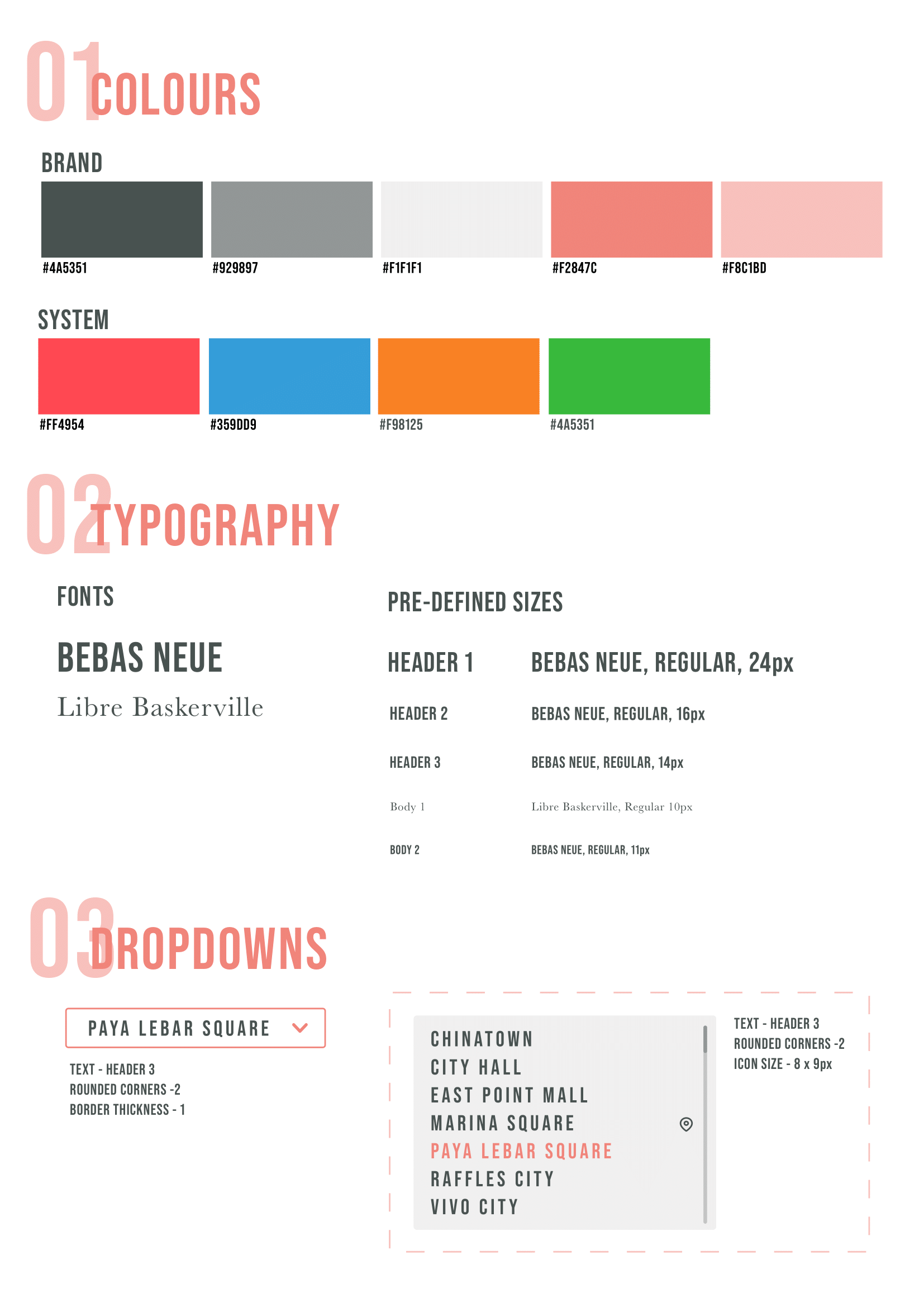
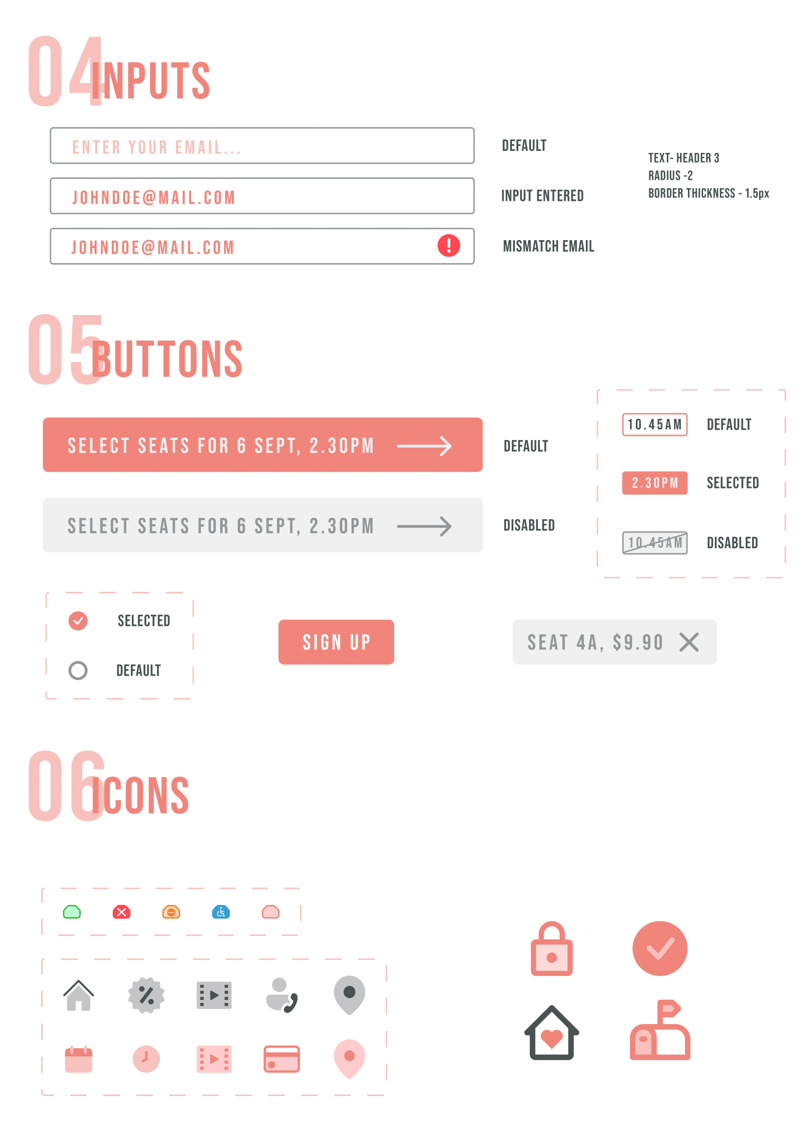
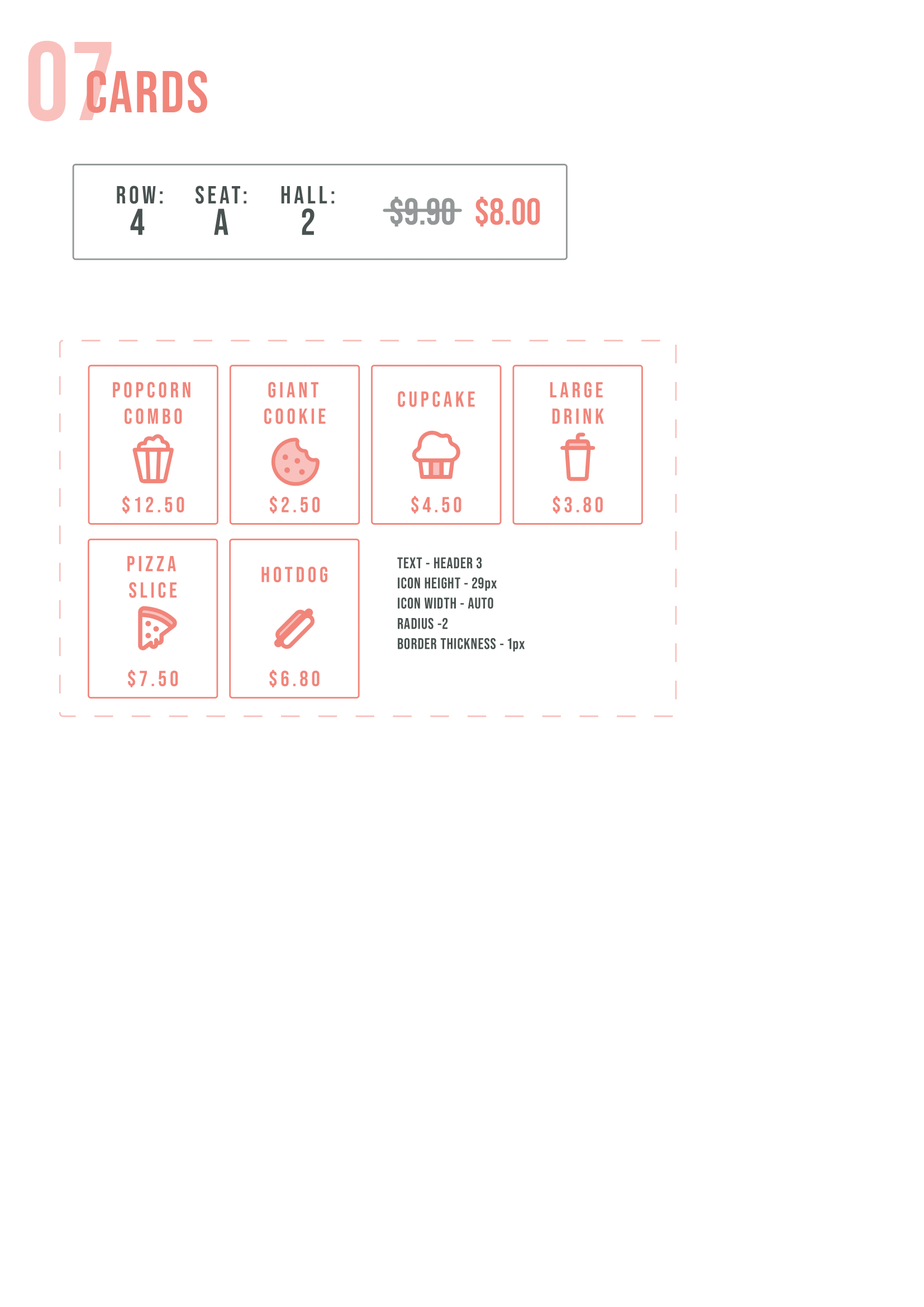
I created a design system heavily inspired by FRANK by OCBC as I wanted the visual design to have a youthful, laid-back yet sophisticated feel to it.
High Fidelity Prototype
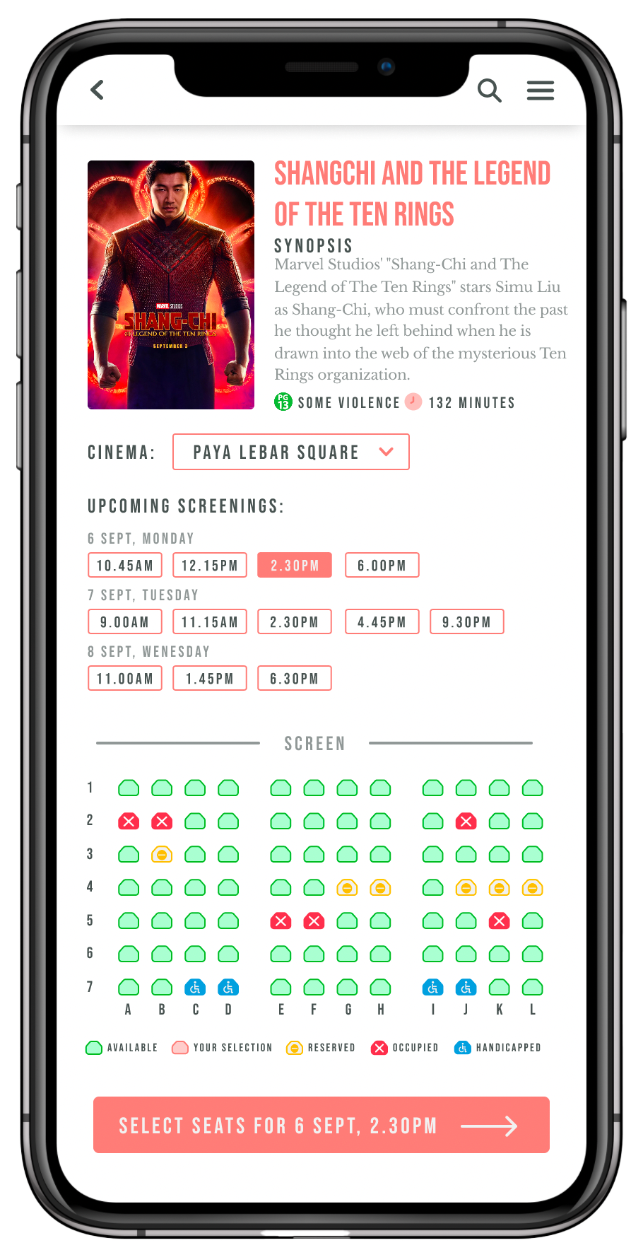
I used Figma to created the mockup, and you can see my initial explorations and UI below, or view this link

Testing
Designs and Iterations towards the final productUsability Testing
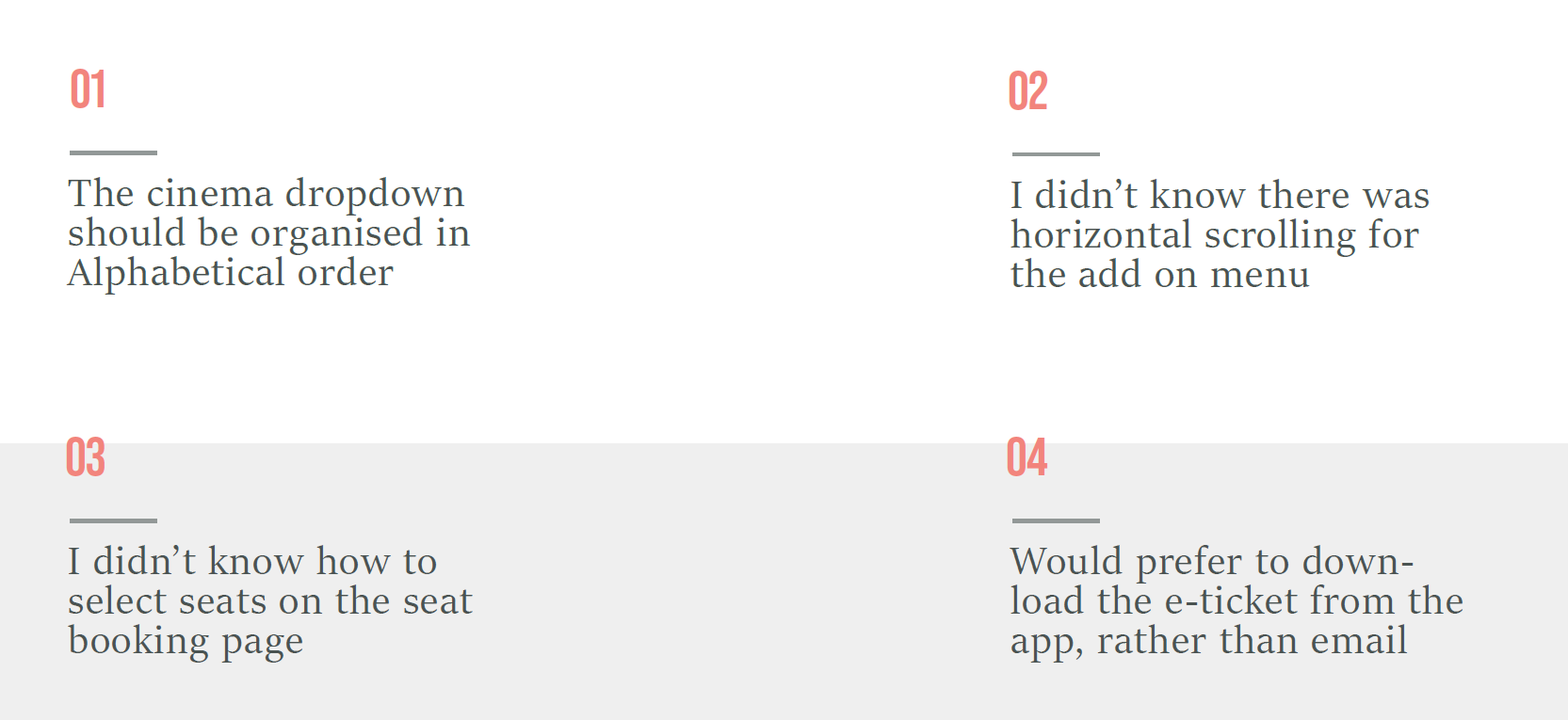
I used the prototype to conduct usability tests with users in the
target demographics. The overall feedback was that the app was
easy to use and were happy with the theme and design. However,
there was also some areas for improvement which helped me uncover
opportunities to improve on my initial prototype.
Below are some of the feedback I received:
Submission
My final prototype!Final Prototype
With the user feedback I got, I updated the prototype. Most of the
changes made were minor, such as increasing font size and adding
scroll arrows. Some of the bigger changes were adding UI to guide
users how to selecct seats on the sear booking page, and adding an
alternate button for when a cinema is fully booked.
You can view the Figma Prototype here
Below is a more in-depth explanation of the final
prototype
