Sentient.io

My Role

I worked closely with one other senior designer, helping internal teams in several different projects to conceptualise and design unique, user-centric products using Figma

Duration:

5 months

Responsibilities:

UI Design, Design Systems, Prototyping, Frontend Developer

ScribeRabbit

The first internal project I worked on

What is ScribeRabbit

ScribeRabbit is an AI-enabled video transcription platform developed by Sentient.io. The target users are video transcription freelancers, content providers (such as media agencies), as well as individuals who have large amounts of videos that need to be transcribed in a fast and easy manner.

My Responsibilities

As ScribeRabbit was still in beta testing, I was tasked with the following:

  • Design a user friendly landing page for ScribeRabbit that represents the branding and communicate the features of this platform
  • Conceptualise and design various user flows for the web service, such as the login, sign up and user profile pages
  • Improve the existing UI/UX based on feedback from the beta testing users
  • Take into account the future expansion plans of ScribeRabbit, and how the UI/UX will be affected

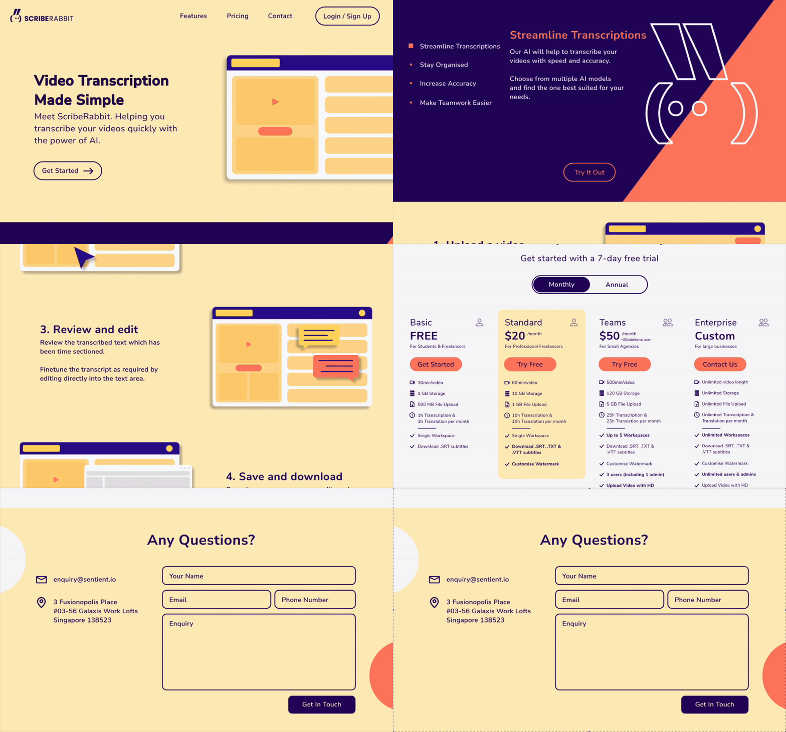
Designing the Landing Page

I kept in mind the following objectives:

  1. Helping visitors of the site understand what ScribeRabbit does, and how it can help them with their work of video transcription
  2. Encouraging visitors of the site to join the platform


Below the final product can be seen on the left, as well as some of my thinking behind the designs on the webpage.

Split Complementary Colors

  • Helped the website to stand out

  • Used a vibrant and bold theme

  • Attract user's attention

Purposeful Page Layout

  • Strategically placed Call-To-Action buttons

  • Information given in easily digestible bite-sized chunks

  • Focus on readability

Pricing Plan

  • Allow potential customers to view all possible options at a glance

  • Call-To-Action buttons for each relevant plan

  • Allowing of sufficient white space

Contact

  • Allow customers to seek more information if needed

  • Easy to fill in form

  • Relevant contact information on the left column

Developing the Landing Page

I also got to do some front-end development using the Quasar Framework. Given that the mobile mockup was not done on Figma, I stepped in to help the frontend developer to ensure the webpage was mobile responsive.

I ensured that the components were developed as according to the mock up done on Figma and that the website was mobile responsive, editing the components and CSS as needed.

I developed the breakpoints to ensure the components would be viewed properly on all screen dimensions.

Beta Testing Feedback

As i was not part of the Product Management Team, I did not take part in the feedback gathering interviews. However, I did get to discuss with the product management team and the developers, where we created user stories based on the feedback, prioritised the features to develop, and the changes that needed to be made.

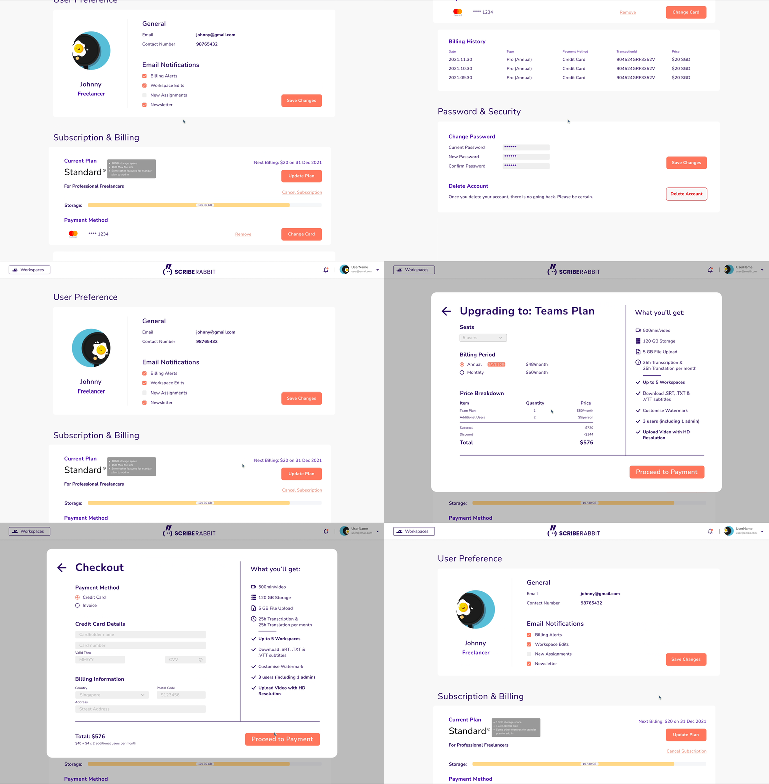
Designing the User Profile

The User Profile page needs to allow the users to do the following:

1 Edit notification settings
2 View and change their subscription plan
3 Update profile details such as email, username
4 Update billing and passwords

Keeping in mind the 4 criteria listed above, the flow for the User Profile was created as seen in the GIF.

Sentient.io's Design System

Ensuring the consistency for future projects

My Task

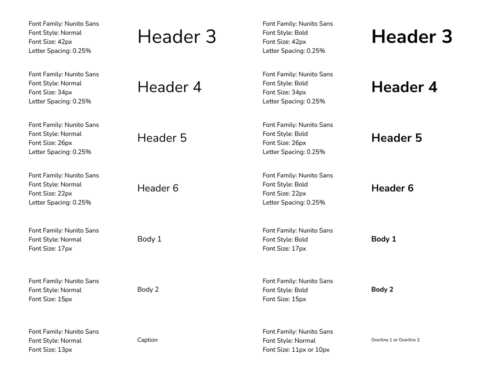
When I joined the team, the previous designers did not create a design system or guide for new team members to follow. However, as Sentient.io continues to expand, there was a need to create better consistency across the different products. As such, I created a Design System on Figma for future designer's and developer's reference, and ensuring the consistency of the brand.

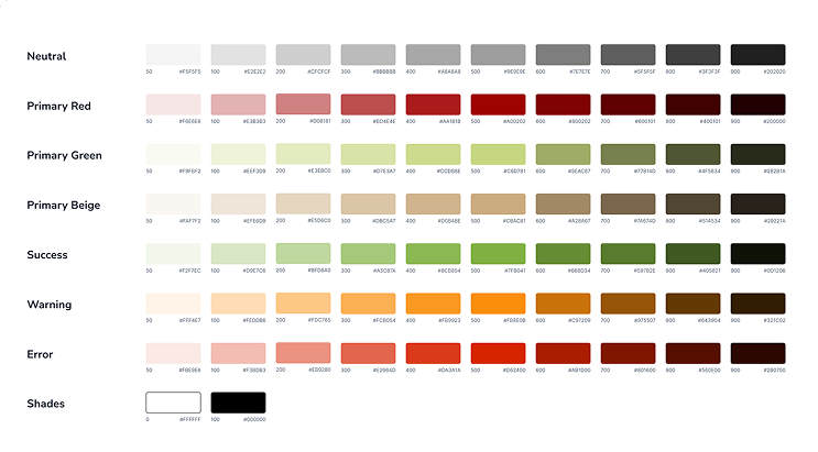
The Colors

Typography

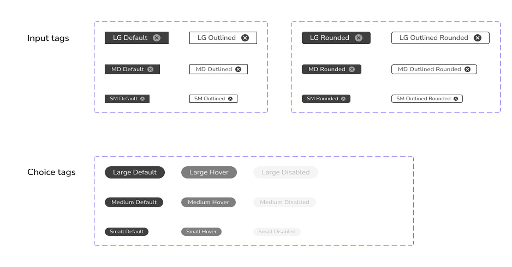
Buttons & Tags

Key Takeaways

My main learning points from this internship

Working Independently & Justified Designs

As this was a start-up, I worked mostly independently, with some guidance form the sole other full-time designer. I was given a lot of autonomouy in my designs, and I got to independently explore and be creative with my designs!

This also meant I had to be ready to justify my designs, which was a good learning experience where I had to ensure all decisions I made were backed up by solid reasoning and design thinking to answer to the clients and the rest of the team.

Importance of Consistency

At Sentient.io I really learnt how important it is to have design consistency throughout the team, from the designers to the developers. Although creating the design system can be repetitive, it really helped the team to become more organised, and helped to speed up the prototyping process as well.

`